Anatomy of a verify-email flow
TL;DR
Offer a code and a link, always both, and never make the link require an existing session, that’s the one that quietly breaks the most in the wild. Get the basics right first: type="email", type="text" with inputmode="numeric" (not type="number"), auto-submit the code the instant it’s complete. Lock the input with readonly, not disabled, while checking, and fail fast in place instead of navigating away.
Rate limit by recipient address, not just by account, or the form itself becomes a way to spam someone else’s inbox. If verification can complete on another device or tab, poll for it quietly instead of leaving a dead screen behind. Full reasoning, sources, and the rest of the checklist below.
One of my side projects logs people in entirely through a third-party OAuth provider, no password, no signup form of my own. Convenient, except that provider doesn’t hand over an email address, so I had no way to reach anyone who signed up, and nothing to prefill once they reached checkout. The fix is a self-serve step that asks for an email after the fact and verifies it, which sounds simple until you actually try to make it feel simple. Almost all the real work turned out to be UX, not backend.
I remember the early days of web 2.0, when a login form or a signup flow being smooth and well thought through was actually a selling point, something people wrote blog posts about, precisely because so few sites bothered. Somewhere along the way, that same flow became a checkbox. Every product needs one, so every product has one, and a lot of them read like nobody who built it ever tried to actually use it. Verifying an email is about as unglamorous as software gets, which is exactly why it’s such a clean test of whether anyone on the other end still cares.
Don’t skip the basics on the email field
Before any of the code-input tricks matter, the first field someone touches is a plain email address, and it’s easy to still get that wrong. type="email" gets you the right mobile keyboard, @ and . sitting right there instead of buried behind a symbols toggle, plus free native format validation. Pair it with autocomplete="email" and a browser or password manager can fill the whole thing in without a single keystroke. Two attributes, and it’s still worth calling out because plenty of forms in the wild ship a bare type="text" for it anyway.
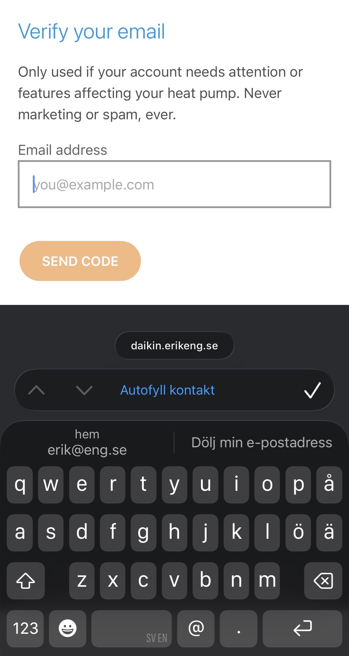
I still haven’t added the next obvious step, catching a typo’d domain before the request even goes out. Type gmial.com and format validation happily lets it through, then the code goes to an address that doesn’t exist and the person’s stuck wondering why nothing arrived. Mailcheck.js has been the standard answer to this for over a decade, a quiet “did you mean gmail.com?” under the field. It’s on my list, not yet in production.
Code and link, always both
Every email carries a 4-digit code and a magic link, and either one completes verification. Some people will copy-paste the code back into the tab they started from. Others will just click the link on their phone without ever returning to the original tab. Picking one over the other means losing a chunk of people who default to the other habit, so I built both paths as first-class, not one as a fallback.
Subject: Your code is 1234

Hi, insert code or click the link below to verify your email.

1234

https://awesome.saas.ai/verify-email/n1c310ng370k3n

If you didn't initiate this request, don't click the link and please discard this email.

Have fun / Erik
The two paths have genuinely different failure shapes, though. The code path assumes you’re still on the device that asked. The link path has to assume you might not be, which is its own can of worms, more on that below.
A link that needs you to be logged in isn’t a link
I hate “this link has expired,” especially the version that shows up because you opened the link somewhere you’re not already signed in, not because any real time limit passed. That’s a lie dressed up as an error message, and it trains people to assume every verification link is fragile and one click away from failing.
So the link never checks for a session. Clicking it verifies the email against whatever account it was issued for, full stop, regardless of which browser, device, or incognito window opens it. If that browser also happens to be signed in, great, redirect straight to the dashboard. If it isn’t, say so plainly instead of pretending the link itself is the problem. The only time “expired” should ever appear is when the link is actually, genuinely expired.
There’s a second, less obvious reason this matters beyond UX: plenty of corporate mail gateways (Microsoft’s Safe Links, Proofpoint, Mimecast) automatically fetch every link in an incoming email to scan it for safety, before a human ever sees the inbox. A link that’s only good for one click gets burned by the scanner, and the actual recipient hits a dead “already used” link that never worked in the first place. Supabase hit exactly this with their own magic links. Making the link idempotent, re-clickable, re-verifiable, doesn’t just avoid a false “expired” message, it’s the only design that survives a security scanner clicking it first.
Postmark’s beginner’s guide to magic links covers the tradeoffs well if you’re weighing whether to build one at all.
Let the code submit itself
Nobody wants to type four digits and then hunt for a submit button. The input auto-verifies the instant it’s full, whether typed, autofilled, or pasted from the email client. That single decision did more for the feel of the flow than anything else I built.
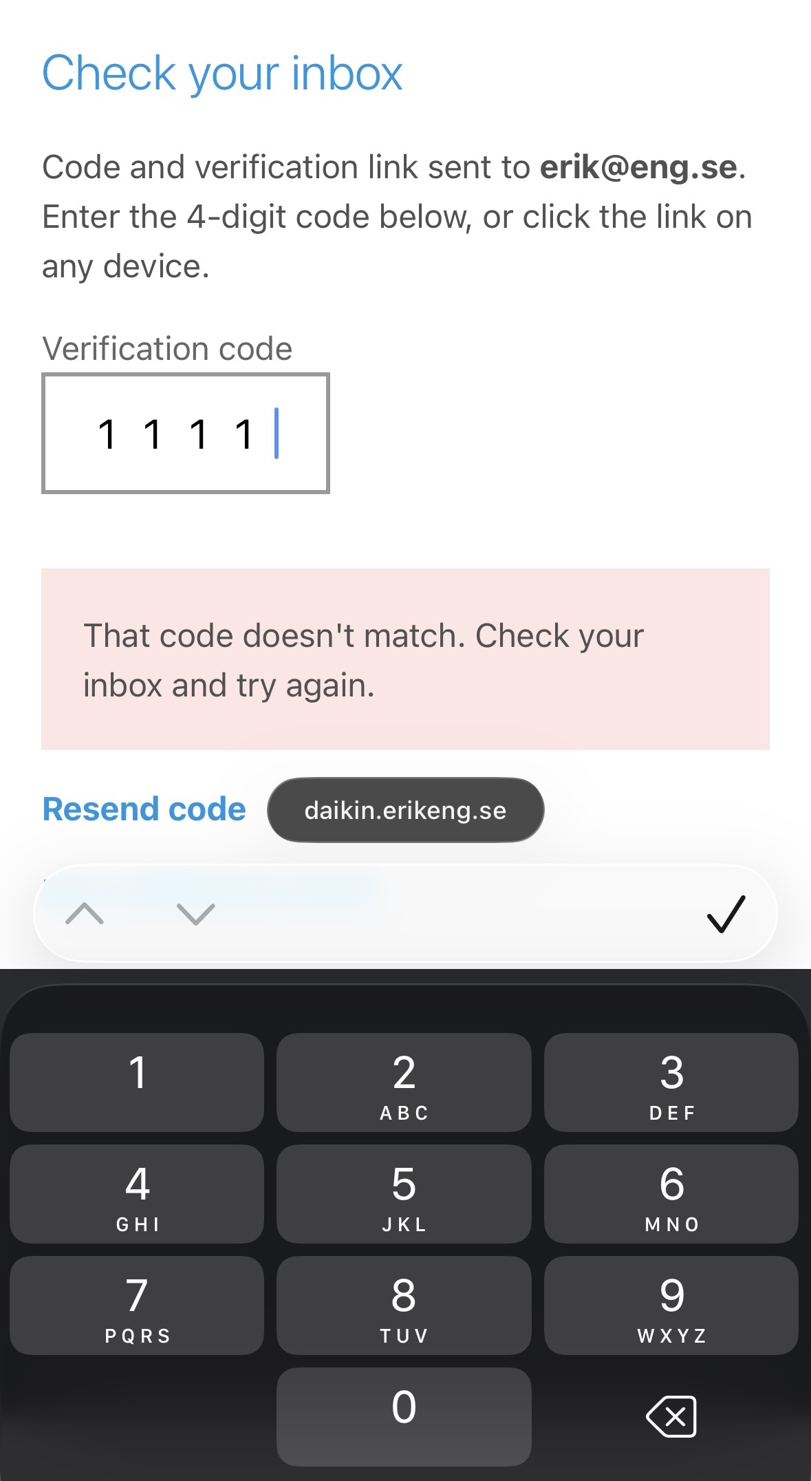
GitHub’s 2FA prompt is what I was chasing: type the last digit and you’re in, no button, no pause to wonder if it registered. Compare that to Microsoft’s, which I’ve hit plenty of times where the field just sits there after six digits, or submits against a stale challenge and throws a generic error, leaving you retyping the same code and hoping the second or third attempt lands. Auto-submit on a complete code isn’t exactly a hard bar to clear. It’s just apparently an easy one to miss.
It also introduced the one input-type bug worth calling out: type="number" silently ignores maxlength. Keep typing past the fourth digit and the value just keeps growing, re-triggering verification against a stale, wrong result every time. Switching to type="text" with inputmode="numeric" fixed it and still gets you the numeric keyboard on mobile.
Google’s SMS OTP form best practices is written for text-message codes rather than email ones, but the underlying idea, autofill the code and get out of the way, is exactly the same. That same autocomplete="one-time-code" attribute is also what lets iOS 17’s Safari suggest the code straight out of the Mail app above the keyboard, no copy-paste required, for a code that arrived by email rather than text.
Move the focus for them
Every step transition moves focus to whatever field the user needs next, so the whole flow can be done without touching the mouse. Land on the ask-email step, and the email field is already focused. Send the code, and the moment the code input appears it’s already focused too, ready for the paste or the first digit. It sounds trivial, but every click you save is one less place someone can hesitate, get distracted, or bounce.
The trap here is doing it on a re-render instead of on the actual transition. Autofocus that fires every time the component updates just yanks focus away from someone mid-type. It has to be tied to the state change itself, once, not to the field existing.
Lock the input, don’t disable it
While a code is being checked, the field needs to stop accepting more input, but disabled was the wrong tool. A disabled input drops focus and turns grey in a way that reads as broken, and on some browsers you can’t even select the text anymore to see what you typed. readonly gets you the same “stop typing” behavior while keeping focus, selection, and full legibility intact. Small difference, but it’s the difference between “the page is thinking” and “the page just froze.”
Léonie Watson’s screen reader tests on disabled vs. read-only fields is the clearest breakdown I’ve found of what each attribute actually does to assistive tech, which is usually the part left out of the conversation entirely. Reading it is what made me go back and add role="alert" to the error messages and aria-busy alongside the readonly toggle, since readonly on its own tells a screen reader nothing about the field being temporarily locked, and a plain hidden toggle on the error text announces nothing at all.
Fail fast, and stay in the same place
A wrong code has to fail instantly and cheaply, no page reload, no navigation, just the code input swapping for a short inline message and resetting itself for another attempt. Anything slower than that turns a typo into a small ordeal. I also kept the UI optimistic on network failure specifically: if the verify request itself errors out, rather than a wrong-code response, the field goes back to editable with a “something went wrong, try again” message instead of a dead end. Same code, no re-request from the email, just retry.
Cap retries, but don’t punish honestly
Guessing a 4-digit code isn’t hard if you get unlimited tries, so attempts are capped. But the cap needed to feel like a safety net, not a wall: a plain-language message when it’s hit, and a way out that isn’t “contact support,” namely, requesting a fresh code resets the count. Resends themselves are throttled too, a short cooldown so the button can’t be mashed, but nothing that makes a genuinely slow inbox feel punished.
Don’t invalidate the one still sitting in the inbox
Hit resend, and it’s tempting to kill the previous code so only the newest one works. Don’t. Email is slow and unpredictable, and it’s completely normal for someone to fire off a second request, then have the first one land anyway a minute late, or open an old tab that still has the original code visible. Any code that hasn’t expired yet should still work, whichever one arrives first. The alternative is a code that looks perfectly valid and fails anyway, which is a worse experience than the slow email it was trying to fix.
None of this matters from the spam folder
Every UX decision above assumes the email actually lands in an inbox, which isn’t a given for a domain nobody’s heard of sending “here’s your verification code” out of nowhere. SPF, DKIM, and DMARC on the sending domain are what an inbox provider checks before deciding whether that’s real mail or something to quarantine. Google’s own bulk sender guidelines require all three past a fairly low volume threshold, and DMARC specifically can start at p=none, report-only, no enforcement, so it’s something to ease into rather than flip on cold. AWS SES’s authentication docs walk through the actual mechanics of setting all three up, useful background given plain SMTP has no built-in way to prove a sender is who it claims to be. Get this part wrong and it doesn’t matter how good the rest of the flow is, since the person you’re trying to help never sees it.
Four digits, on purpose
The “six digits, minimum” reflex comes from RFC 4226, written for authenticator-app codes checked against a sliding resync window and retried more or less forever, not for a single value with a hard, permanent guess cap. NIST and OWASP both frame code length as entropy traded against rate limiting, not a fixed digit count, and a 4-digit code capped at 10 guesses has a 0.1% ceiling on its own, comfortably inside what either standard treats as acceptable.
There’s a real wrinkle worth naming, though, and it’s a direct consequence of keeping older codes valid: several can be outstanding for the same person at once, and any guess matching any of them counts as a hit. Worst case that pushes the real ceiling from 0.1% toward something closer to 1%. Still low, but not nothing, and easy to miss if you only ever do the math against one code in isolation.
I’m keeping four digits anyway. The whole point of the code path, as opposed to just clicking the link, is that someone can read it off their email client, alt-tab to the waiting browser tab, and type it from memory without copying and pasting a thing. Four digits survives that trip. Six starts to fray it. Six is the safer number on paper. Four is the number that still fits in someone’s head for the three seconds they need it to.
The part that only shows up with two devices
This is the one that took the most iteration. Say you request a code on your laptop, then just tap the link from your phone’s inbox instead of typing anything back. The laptop tab is sitting there with a code input that’s about to become pointless, and it has no way to know verification already happened, unless it goes looking.
I solved it with polling from the original tab: quietly ask “has this been verified yet?” on an interval, and redirect the moment the answer flips to yes. A few things made that tolerable instead of janky:
- Poll only while the tab actually has focus, using the Page Visibility API. A background tab burning through requests is both wasteful and pointless, since nobody’s watching it anyway.
- Back off between polls rather than hammering on a fixed interval, and resume promptly the moment the tab regains focus.
- Treat the polling endpoint itself as disposable. If a poll fails, just try again next tick, don’t surface an error for a background check nobody asked to see.
The recipe
- Use
type="email"withautocomplete="email"for the address itself. Basic, and still worth checking for. - Offer a code and a link, in the same email, and treat both as equally important.
- Never make the link require an existing session. Verify the email, then redirect if signed in, don’t gate on it.
- Auto-submit the code the instant it’s complete. Don’t make someone hunt for a button.
- Use
type="text"withinputmode="numeric", nottype="number", so length limits actually hold. - Move focus to the next field on every step transition, tied to the state change, not the render.
- Lock the input with
readonlywhile checking, notdisabled, so focus and selection survive. - Fail fast and in place: swap in an inline error, don’t navigate, don’t reload.
- Cap retries, but make the cap feel like a reset button, not a dead end.
- Keep every unexpired code valid, even after a resend, so a late or duplicate email still works.
- If verification can complete on a different device or tab, poll for it, only while focused, with backoff, and treat failures as silent retries, not user-facing errors.
A caveat: this is still auth
Everything above is in service of a smooth flow, but don’t let smooth turn into permissive. A 4-digit code is a small keyspace, and every one of these UX niceties, forgiving retries, resends, links that always work, is also a lever an attacker could pull if the backend behind it doesn’t hold a hard line. Cap attempts per code, cap sends per hour, expire everything on a real timer, and rate limit by account, not just by request, so someone can’t just spread guesses across fresh sessions. The friendliness lives entirely in how those limits are communicated. The limits themselves should not bend.
One rate limit I’d missed entirely at first: capping sends per account isn’t the same as capping sends per recipient. My original throttle only ever asked “has this account sent too many?”, never “has this address received too many?”, which meant the form itself was a way to flood someone else’s inbox who never asked for any of it, as this writeup on unthrottled OTP sends shows. I added a second cap scoped to the recipient address itself, independent of the per-account one. Worth limiting both directions, not just the one that protects whoever’s logged in.
Troy Hunt’s everything you ever wanted to know about building a secure password reset feature is over a decade old now and still the sharpest rundown of what actually goes wrong in flows exactly like this one.
None of this is exotic, and none of it was in scope on day one. This started as “let’s just capture an email address,” which sounds like a single form field and a database column. It turned into a dozen small decisions about focus, timing, and failure states, and every one of them mattered more than the field itself. That’s usually how these things go: the part that sounds like a checkbox is actually the sum of everything the user notices when it’s slightly off, and none of them individually feel worth writing down until you’ve hit all of them at once.
But I’d argue every one of them is worth doing anyway. If a flow is going to exist at all, I think it’s worth doing everything reasonably possible to help and direct the person through it, not just make it technically function. Autofocus, auto-submit, a link that just works, an error that tells you what actually happened, none of it is required in the sense that the feature breaks without it. It’s required in the sense that it’s the difference between a flow and an obstacle.
Further reading
Two more worth a look, neither tied to a specific section above but both good context: NNGroup’s Passwordless Accounts: One-Time Passwords and Passkeys zooms out to the workflow level, SMS versus email delivery, app-switching, the friction of leaving your browser at all. And Adrian Roselli’s Avoid Read-only Controls argues the opposite side of the readonly call I made above, inconsistent styling and inconsistent screen-reader exposure across JAWS, NVDA, VoiceOver, and TalkBack make it more of a liability than I gave it credit for. Worth forming your own opinion on that one rather than taking mine.